a picture is worth 1000 words
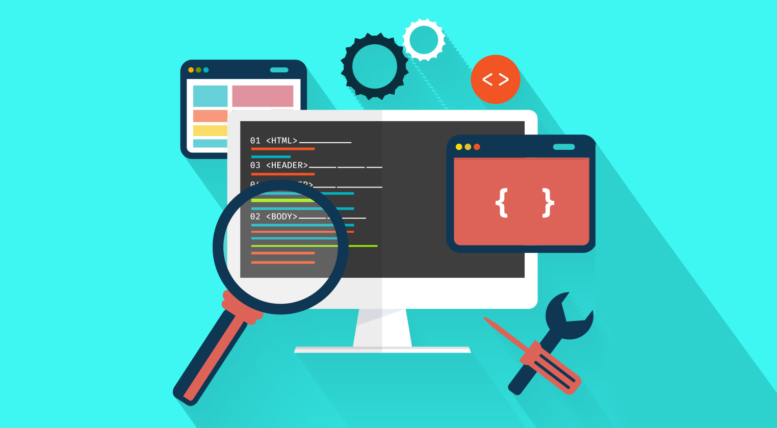
In todays modern design landscape a pictuer is worth WAY MORE than 1000 words. I would feel confident betting that if your landing page has the a low quality image on it that you lose 80% of your potential customers before they read one word on your site. I'll give you three examples and I bet I can tell you in order what you would drawn to first. Take a look:
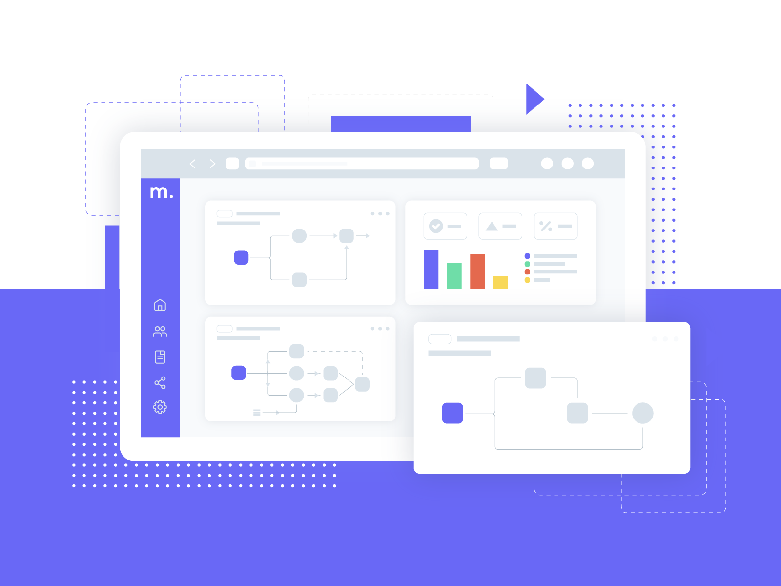
Option 2
Marketing
Your Title
Its amazing how the placement of an image changes the page.It goes to show how placement on a page is everything.
View project
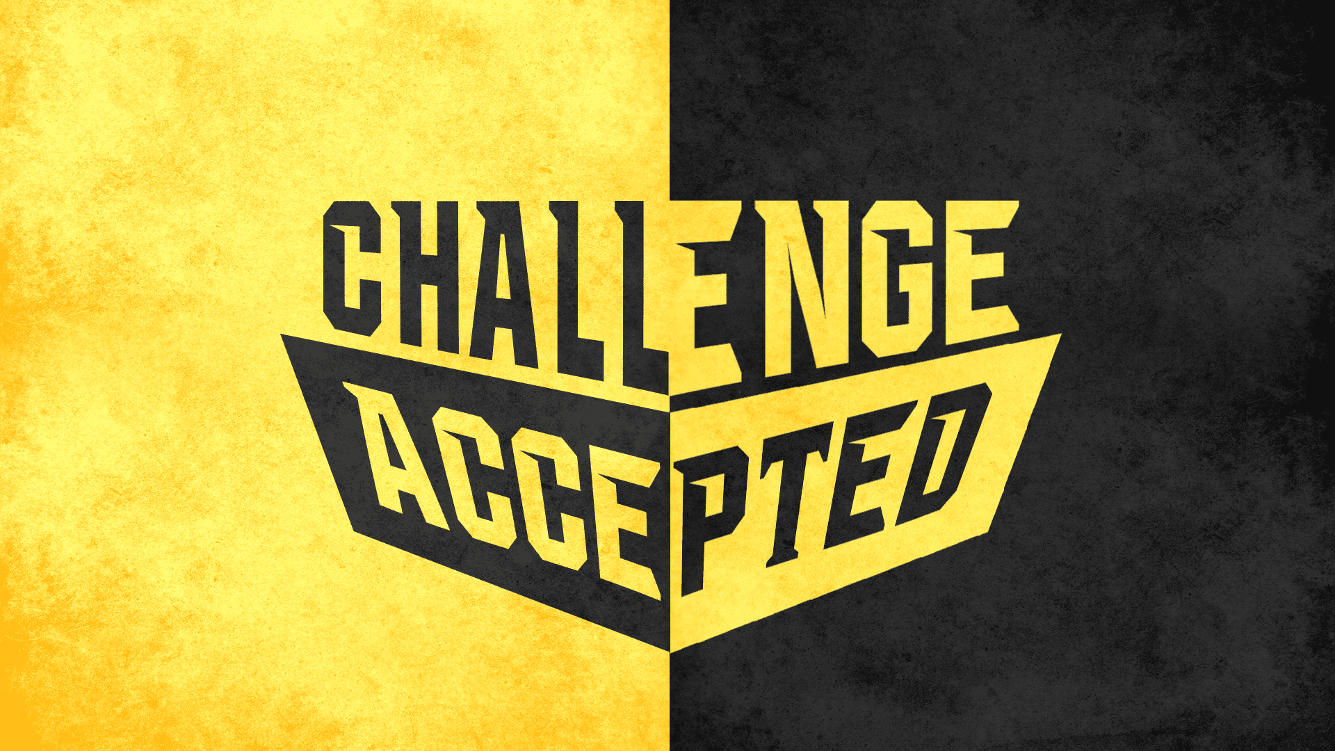
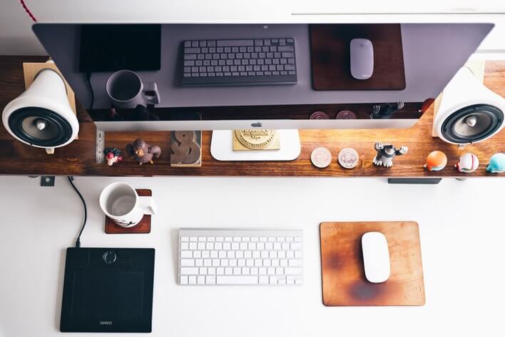
I would choose option 1 or 3 for my layouts becasue the image quality is high, they are both bright and vibrant, and it draws your eye into the page. In the end, option 1 wins for me since its so simple and organzied its hard not to key on it. But, the other key part of this discussion we have to address is the location of the image on the page. You can take the layout of option 2 and make it a beatufil landing page with a brighter picture and a little text contrast. I am going to take the picture from option 3 and put it with a title and a button and it looks like a professionally designed landing page.
I know... its crazy, but I just added a small text shadow for the title and a simple stock button and the page begs you to click for more information. This is a classic tool that any developer has to have in their arsenal. The ability to filter out quality images to create a connection with users that makes them want to know more. That simple slice of a page has 6 total words on it, but those words are so powerful because of the statement image they are layered over.
One page landing pages rely on the quality of the images to make your eyes jump around and find the colorful buttons that are calls to action. Parallax pages take advantage of the scrolling photos that catch you eye as they move at a different pace than the text that is in front of them. It all boils down to how clean of a picture can you find, and where do you find them?
If you are on a budge head over to Pixabay.com. They have a great deal of user curated pictures that are license free and you can use on all your sites. Its a great start on your road to design since you can try multiple options before you settle on the exact picture you need. If you dont have to worry about price, shutterstock.com is the best source of high quality pictures I have found.
I know this is a short post, but its amazing how the quality of 1 or 2 pictures can change the complexion of the site you are designing. Always remember that a moving image can replace all the words on the page you making so choose carefully. Till next time friends, thanks for reading Digital Class!